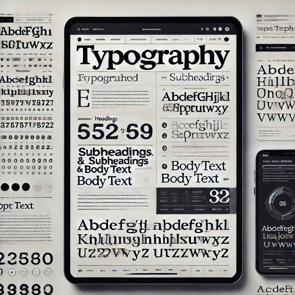
How to Use Typography Effectively in Web Design
1. Choose the Right Font Combination
Selecting appropriate fonts is essential to set the tone of your website. Fonts can express the personality of your brand—whether it’s formal, playful, modern, or traditional.
Tips for Choosing Fonts:
- Limit Your Font Choices: Avoid using more than 2-3 font families in your design to maintain visual consistency. A common combination is pairing a serif font with a sans-serif font.
- Complement, Don’t Clash: The fonts you choose should complement each other. For instance, a bold, heavy font for headings can be paired with a lighter font for body text.
- Check Readability: Ensure that the chosen fonts are legible across all devices, including mobile screens.
Example:
- Use Georgia or Times New Roman for headings and pair them with a sans-serif font like Arial or Roboto for body text.
2. Establish a Clear Hierarchy
Visual hierarchy guides users through your content, helping them identify what is most important. Good typography helps establish this hierarchy by controlling the flow of information.
Ways to Establish Hierarchy:
- Font Size: Use larger font sizes for headings, medium sizes for subheadings, and smaller fonts for body text. This helps users scan content easily.
- Font Weight: Using bold and light font weights can create contrast. Bold text draws attention, while lighter fonts make text less prominent.
- Font Color: Differentiating important text elements with color adds emphasis. Stick to your website’s color palette to maintain consistency.
Example:
- Headings should be bold and 32px or larger, while body text can be around 16px.
3. Prioritize Readability
No matter how creative your typography is, if users can’t read it, the design fails. Readability ensures that the text is legible and accessible on all devices.
How to Ensure Readability:
- Font Size: For body text, stick to a minimum of 16px to 18px for optimal readability on desktops and mobile devices.
- Line Height (Leading): Proper spacing between lines makes text more comfortable to read. A line height of 1.4 to 1.6 times the font size usually works best.
- Letter Spacing (Tracking): Adjust the space between letters for legibility. Avoid overly condensed or widely spaced text.
- Contrast: Ensure there is enough contrast between the text and background. Dark text on a light background or light text on a dark background is ideal.
Example:
- Body text at 16px with a line height of 1.5 ensures comfortable reading.
4. Use Responsive Typography
In web design, responsive typography ensures that your text adapts to different screen sizes, providing an optimal reading experience on desktops, tablets, and mobile devices.
Best Practices for Responsive Typography:
- Use Relative Units: Instead of defining font sizes in pixels, use relative units like
emorrem. These units scale based on the root font size, making text responsive to screen size changes. - Media Queries: Use CSS media queries to adjust font sizes for different screen widths. For instance, increase the heading size on larger screens and reduce it on mobile devices.
Example:
css
        h1 { font-size: 3rem; /* Responsive font size */ }
        @media (max-width: 768px)
        {
             h1 {
             font-size: 2rem; /* Smaller font for mobile */
        }
     }
5. Create Contrast Between Text Elements
Contrast in typography helps create distinction between various text elements, guiding users through content and improving user experience.
Ways to Create Contrast:
- Font Size and Weight: Make headings noticeably larger and bolder than body text.
- Font Style: Use italic or underline styles sparingly to add emphasis.
- Font Color: Assign different colors to headings, subheadings, and body text to make them visually distinct.
Example:
- Use bold, larger fonts for primary headings, and lighter, smaller fonts for secondary text.
6. White Space and Alignment Matter
White space (or negative space) around text allows the design to "breathe" and improves readability. Proper alignment of text adds structure to the layout, making the content easier to scan.
Tips:
- Don’t Cram Text: Give enough padding and margin between text blocks, headings, and images to avoid clutter.
- Use Left Alignment: For body text, left alignment is usually the most readable format on the web. Center alignment works well for headlines or short content but can be harder to read for longer text blocks.
Example:
- Leave at least 20px of margin between paragraphs and 30px padding around text containers for optimal readability.
7. Pay Attention to Accessibility
Accessibility ensures that your website is usable by all people, including those with disabilities. Typography plays a key role in making your website accessible.
Best Practices for Accessible Typography:
- Font Size: Make sure the text is large enough for users with visual impairments to read comfortably.
- Color Contrast: Ensure there is sufficient color contrast between the text and the background. Use tools like the WebAIM Contrast Checker to verify this.
- Avoid All Caps: All-caps text can be harder to read, especially for users with dyslexia. Instead, use proper capitalization to improve readability.
Example:
- Use large, readable fonts with high contrast like black text on a white background to accommodate users with visual challenges.
8. Consistency is Key
Consistency in typography creates a harmonious and professional look across your website. Use a consistent font size, style, and spacing throughout the design to ensure users don’t get confused or overwhelmed.
Tips for Maintaining Consistency:
- Define a Typography Style Guide: Set predefined font sizes, styles, colors, and spacing for headers, subheaders, and body text.
- Stick to Brand Guidelines: Align your typography choices with your brand’s style, ensuring your website reflects your identity.
Example:
- H1 headers are always 36px, body text is always 16px, and button labels use a consistent font weight of bold.